.webp)


One of the most common feature requests that I have heard throughout the years regarding platforms and software solutions is the need for dashboards. Personally, I have a love / hate relationship with the idea of a dashboard because they are often overly complicated, providing either far too much data or not the right data at all. As usual, the team at env0 attempts to provide a balance between usability and accessibility.
Because we understand the difference in audience and consumption preferences, we have provided a few ways for you to consume the latest feature outside of this blog.
- env0 docs - Organization Dashboards
- Video from Tim Davis
As a design principle, we at env0 belief the definition of a dashboard is as follows:
“Dashboards provide you with a broader and aggregated overview of the system usage.”
Based upon countless hours of speaking with SREs, DevOps practitioners, Iac Developers, and Management; we have decided to introduce Organization Dashboards that help solve the following areas of visibility:
- Activity
- Summary
While my title may include “Director” in the name, I am a technologist at heart and prefer to focus on the value for SREs, Developers and practitioners first.
Activity
The goal of the Activity summary is to highlight the deployments, environments and activity associated with each.
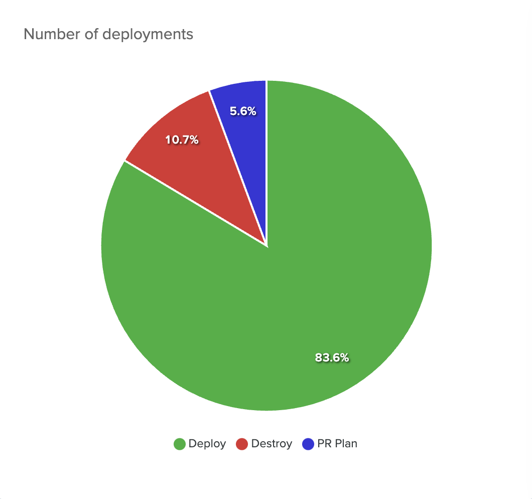
Deployments Pie Chart
Percentage of all deployments by type:
- Deploy
- Destroy
- PR Plan
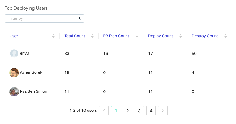
Top Deploying Users
All users, ordered by a total number of deployments from highest to lowest. The screenshot below also highlights the type of activity associated with each user.
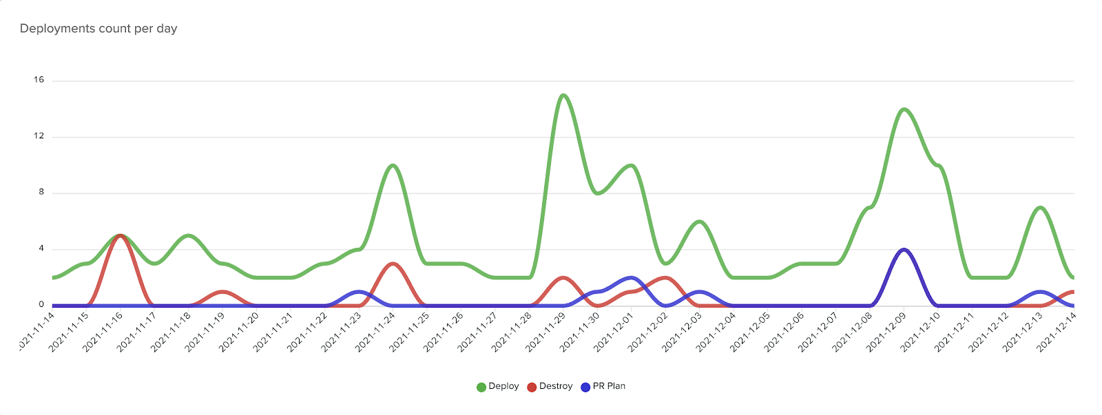
Number of Deployments Per Day
This simple graph highlights a simple trend for each deployment type.
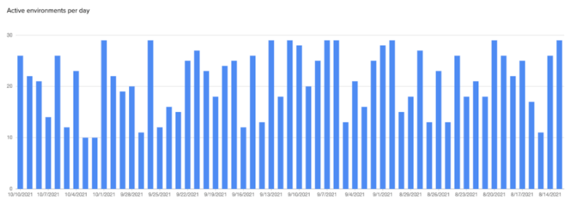
Active Environments Bar Chart
Shows the number of active environments at the moment the scheduled task was triggered (per day).
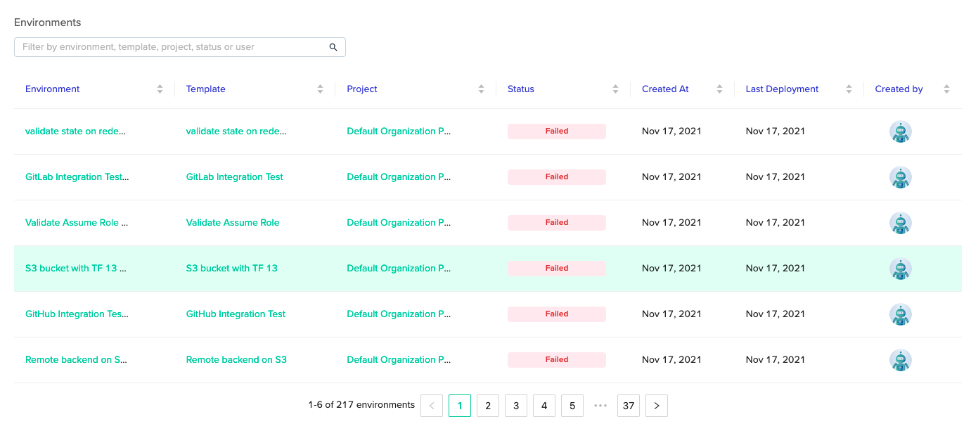
Active Environments Table
Contains all environments which can be filtered by several attributes such as name, project, status, etc…
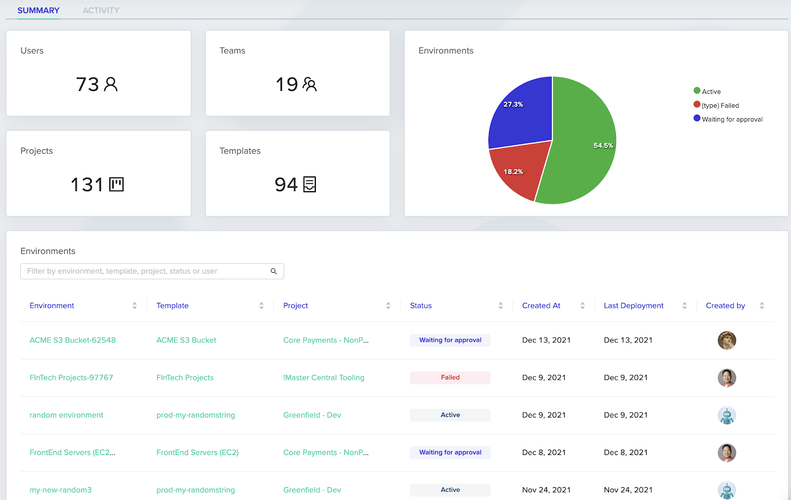
Summary
The goal of Summary is to provide a high level overview of the most common questions that need an answer about your Teams, Projects, Deployments, and Environments.
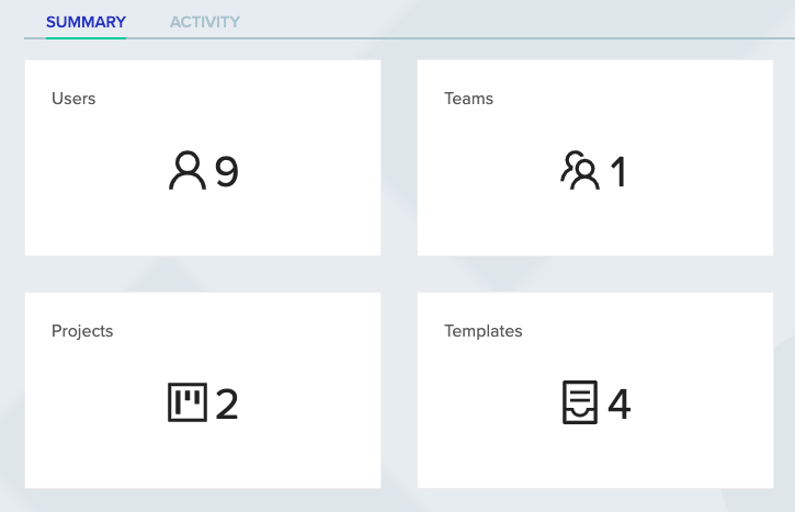
Counts
Shows totals for the following:
- Users
- Teams
- Projects
- Templates
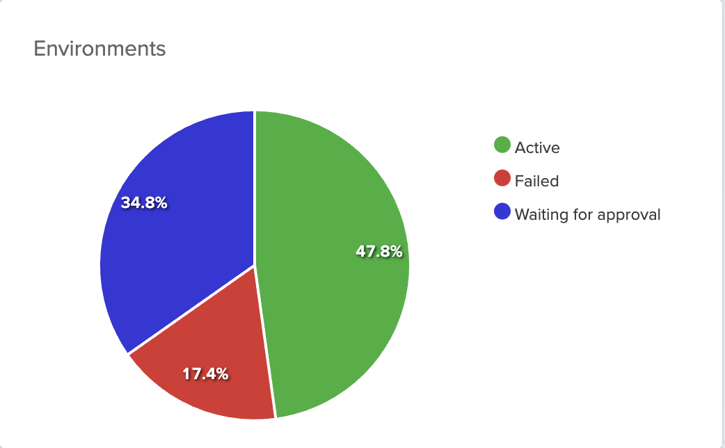
Environment Pie Chart
All environments, sliced by the following:
- Active
- Failed
- Waiting for approval
Environments Table
This is the same exact table as found in the Activity section. We included this in both views based upon feedback from users.
Additional Details
Excluded data
Archived projects and environments are excluded from the aggregations.
Calculations
The data presented in the dashboards is calculated during each page load or refresh. Except for the Active Environments bar chart, which is updated using a scheduled task, once a day.
Each of these views are meant to simplify the consumption of data because environments are large, deployments are changing regularly, and the amount of folks interacting with env0 on a regular basis.
If you have any feedback or thoughts on what else the env0 team should include in Activity, please let us know. We love the feedback and interaction with the community!